Color Theory in Portrait Photography
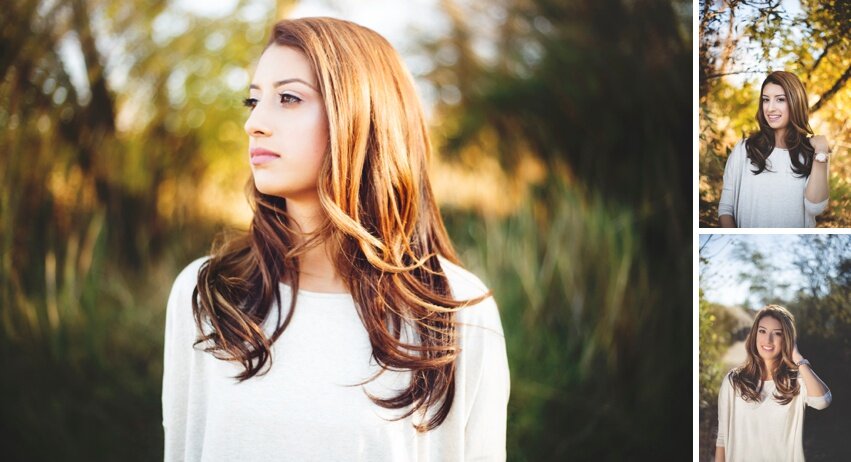
Today I'm going to be blogging about how I choose outfits, locations and why I edit the way I do. When a client comes in for a fashion consult we look through outfits together and speak about what their goal is for their session. In preparation I send my clients a questionnaire about settings and vibes and styles they may want but once we do our fashion consult it starts to all come together. When working in commercial and editorial photography color theory always comes into play. Amid shooting for a brand we often explore which colors can convey certain moods and feelings, what combinations will stand out and please the potential viewer. In the end, I love to apply these techniques to my non-commercial clientele including my High School Seniors.
1-3 weeks before our session my senior clients come in for their Fashion Consult. At this consult, they bring in outfits from their own closet and are also able to choose items from my LMCStyleCloset. I try to provide something for everyone, from my teen clients that want something classic and glam to my clients who want to wear some of my more fashion-forward pieces.
COLOR ON COLOR
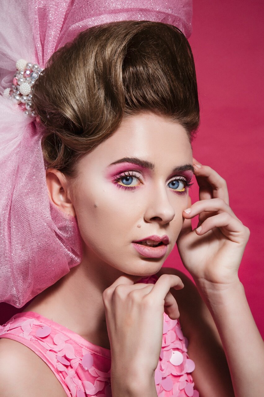
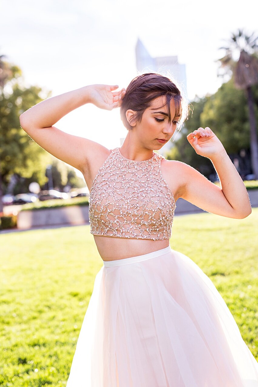
Recently I did a fun shoot with Victoria a Class of 2018 Senior who is looking into becoming a model and actress. With my 'portfolio development package' add-ons clients can get their Senior Portraits and upgrade to an editorial session day as well. As you can see above, Victoria's bubbly personality and fierce blue eyes made her PERFECT for this pink on pink look! Would I recommend this for a regular senior session? Absolutely not! But in commercial photography you can push the envelope. Hair, Makeup & Bow prop by the incredible Styles By Matt
Why COLOR ON COLOR works
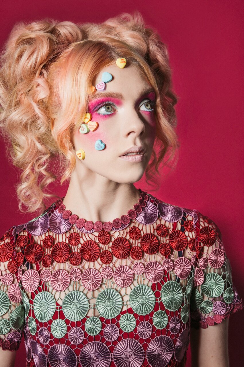 Check out this Valentine shoot with Chrissy! Another fun one with Styles By Matt doing Hair & Makeup. As you can see, Color on color works so well in photography because it's pleasing to the eye. I think back to my childhood and some of my favorite cartoons were color coordinated. Like all of the Sprites in Rainbow Brite and the Deck of Cards March scene in Alice In Wonderland. There is an automatic comfort that comes with order and organization. Color on color does not always have to mean BRIGHT though...
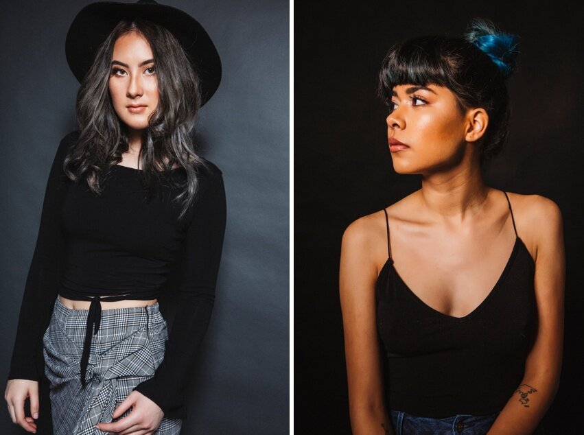 Check out Ashlyn (left) and Juanita (right) Greys and Blacks can be equally stunning for color on color shoot depending on the mood and feel you'd like to convey. In this instance, for Ashlyn I chose Fashion Grey by Savage Seamless and for Juanita we went with Black Seamless also by Savage SeamlessGrey on Grey and Black on Black creates a mood. Ashlyn had silver hair, and the gray skirt but its still pops! Whereas with Juanita we wanted the focus to be on her beautiful face and lines to show off her model shape.
Grey on Black vs Black on Grey
 Gray is a true neutral. It's steady. It can make almost anything around it pop. When shooting portraits wearing muted greys I tend to choose a dark blue or black drop. As seen above, tit makes the subject stand out. Black in front of grey also works but only if there is texture and color to bounce light off of to compel the eye.
Ok, What About Shooting Outdoors?
 Obviously, we have a little less control over what the outdoors will look like. Depending on the season you should know the areas you shoot well and predict what colors you may encounter. Living in Sacramento, Ca I have some amazing locations I shoot in. Both Senior clients Julia (L) and Lara (R) had their hair & makeup done by Beauty By Lorena. I shot both of these within a month of each other. Julia brought this gorgeous pink sweater and I loved pairing it with a lovely backlit green scenery. However, with Lara's look since it was the end of fall I wanted to pick up those beautiful colors of this #LMCStyleCloset shirt with the lush leaves as the background.
 Just because you're shooting outside, doesn't always have to mean nature. Check out Maya (L) and Ashlyn (R) with Hair by Heather Grabin Hair and Makeup by Styles By Matt. As you can see, shooting bright colors and busy patterns call for neutral backgrounds. Therefore you should find places with blocks of color and repeating patterns so the focus is still on the subject.
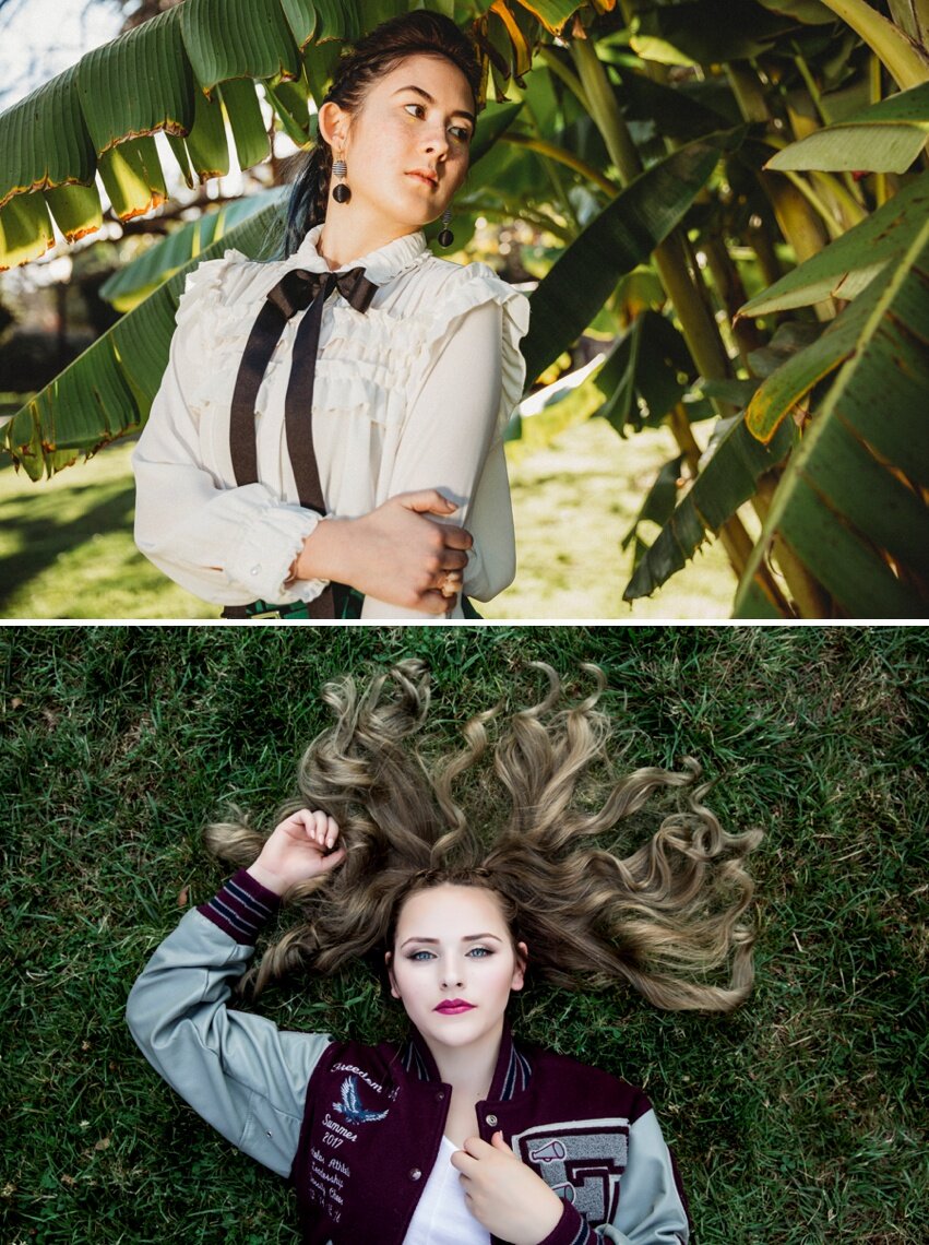
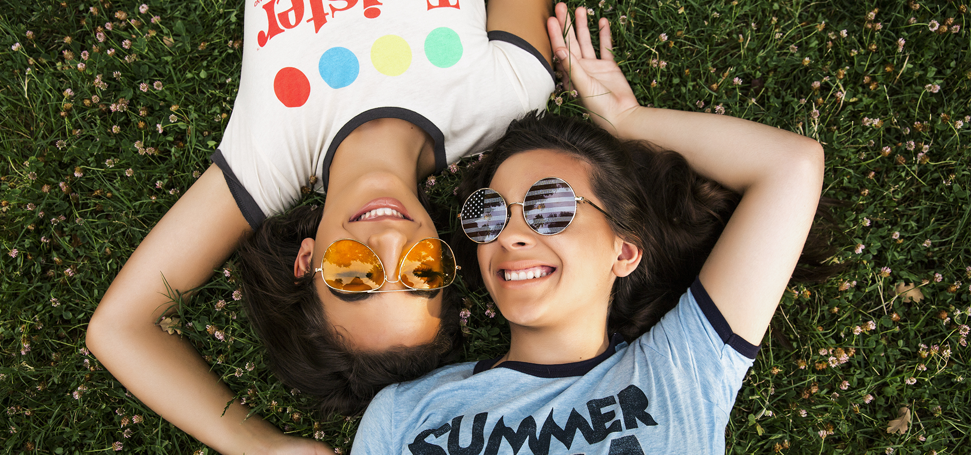 Greens... Find interesting lines that lend to a general feeling of a shoot. Ashlyn (above) has a simple colored top but it comes with a lot of texture. Whereas Summer (below) has her Letterman Jacket on, simply shooting a subject on grass can be drab and boring and something we can all do on an iPhone. However by paying attention to your angles and styling can take your photos to a different level. Keeping the viewer's interest is key. For instance, pairing Summer's Letterman jacket with a bold lip and splaying her hair out and around her really brought this shot together.
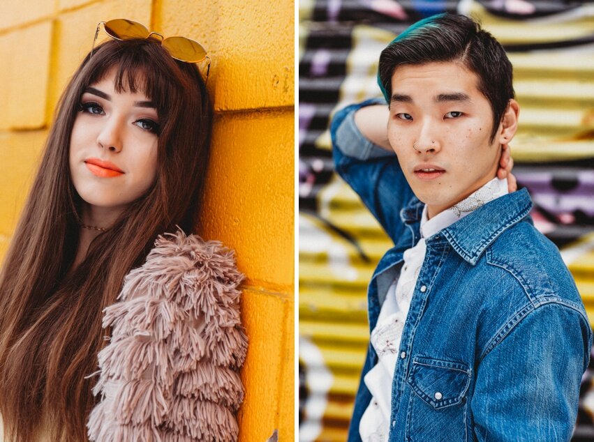 I love using warm yellows for backgrounds when my subjects have such strong looks. Alexis went with this 70's vibe that paired perfectly with this 70's orange wall! Isaac needed a fun pattern to go with his denim look for the perfect headshot.
Opposites Attract
 Dynamic Color Styling. Head on over to this COLOR WHEEL module and look at the different combinations you can come up with. For example orange and Blue are definitely one of my favorite complimentary combos!
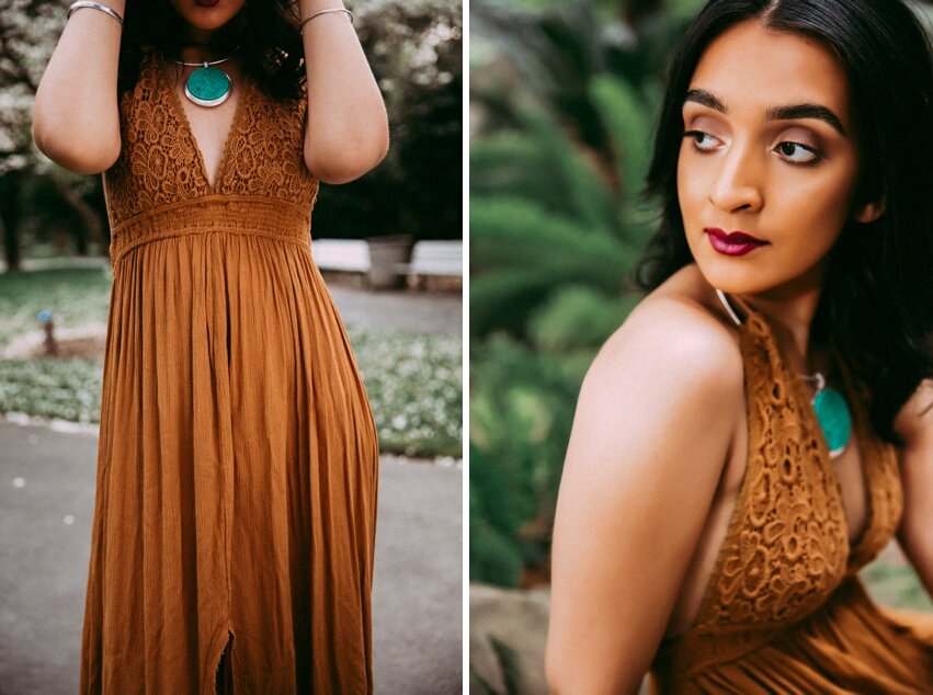 Whether you're playing with complementary colors within the outfit itself or with the scenery it's important to take into account all the elements including hair, skin tone, and makeup. As you can see above, Raj had beautiful rich tones in her skin which meant she could totally pull off this goldenrod colored dress from local boutique Wander & Grace. I love this dress. Indeed, the boho feel with a little sophistication. It transports you to a warm summer evening instantly and I love pairing it with this turquoise pendant.
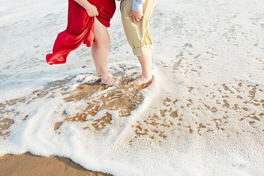
Making The Most Of Reds
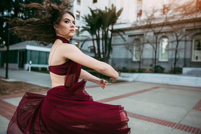 Julia is a beautiful dancer. When she brought this gorgeous red costume from a recent lyrical performance I knew we had to shoot it in front of the State Capitol. As seen above, the greys and whites of the background make this outfit and my beautiful subject really stand out!
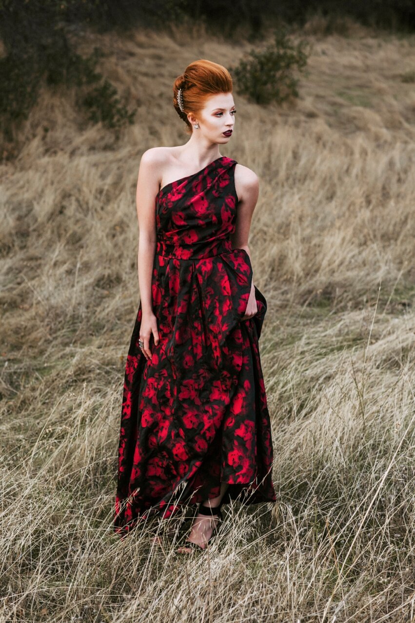
 Red doesn't like sharing the spotlight. Therefore, most photographers shy away from this bold color. Heck, I used to avoid it like the plague! But challenge yourself and try working with it. It can make for the most beautiful work in your portfolio. Kelsey really popped against this field of neutral tones.
Using Neutrals

 Neutral on neutral can be a really beautiful look if done right. Whenever using make sure your lighting is perfect or it can look too muddy.
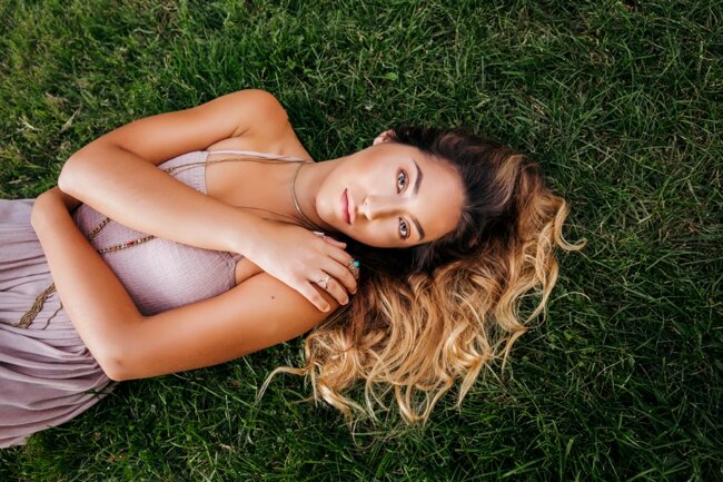
 I love this mauve color. It was all the rage in 2017 and is still going strong in 2018. Shooting neutrals can be tricky. However, natural and outdoor scenery can still be bold. And neutrals need something to help them stand out. Yes, denim is considered a neutral.
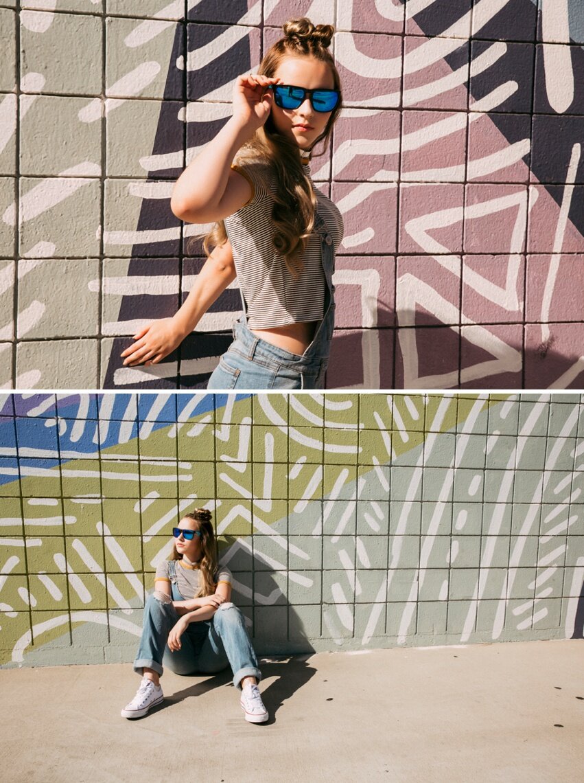
 If you can pair denim with nearly anything. It is a neutral. Therefore, you should keep that in mind when styling as well as scouting.Whether your neutrals are light or dark they need to pop and be cohesive with the scenery.
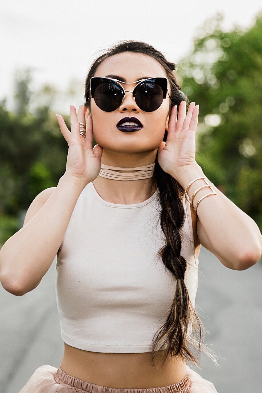
 I hope you enjoyed this snippet into portraits and color theory! If you want to work with me, check out the packages I have available here! Xoxo, Lacey